Now you see it
I'll never forget the "Black Monday" when we received news no SaaS B2B team wants to hear: For six years, not a single customer left. Then, one did. Was this avoidable? Could we have detected it sooner? Those questions haunted me.
Then, an idea hit: What if we could predict churn before it happened? Were other customers silently slipping away? I decided to explore how to build a Churn Dashboard, a tool that I felt a Customer Success Manager would use to monitor customer's health. Imagine turning raw data into a crystal ball, one that shows you which customers are drifting away, months before they leave.
Mastering the Art of Dashboards
Through research, I identified key pain points and metrics to track whether clients were using our platform effectively. Building a "Health Score" with these parameters would let us address gaps before they turned into lost customers.
I wanted to build something different, a tool where the data spoke for itself. Although I had previously created dashboards, this time I was determined to master data visualization.
I read Information Dashboard Design by Stephen Few, a book that rewired my brain and blew my mind. I learned why pie charts fail, the power of sparklines for trends, and bullet charts for goals. Most importantly, I learned that dashboards should answer critical questions in seconds, not just look pretty.
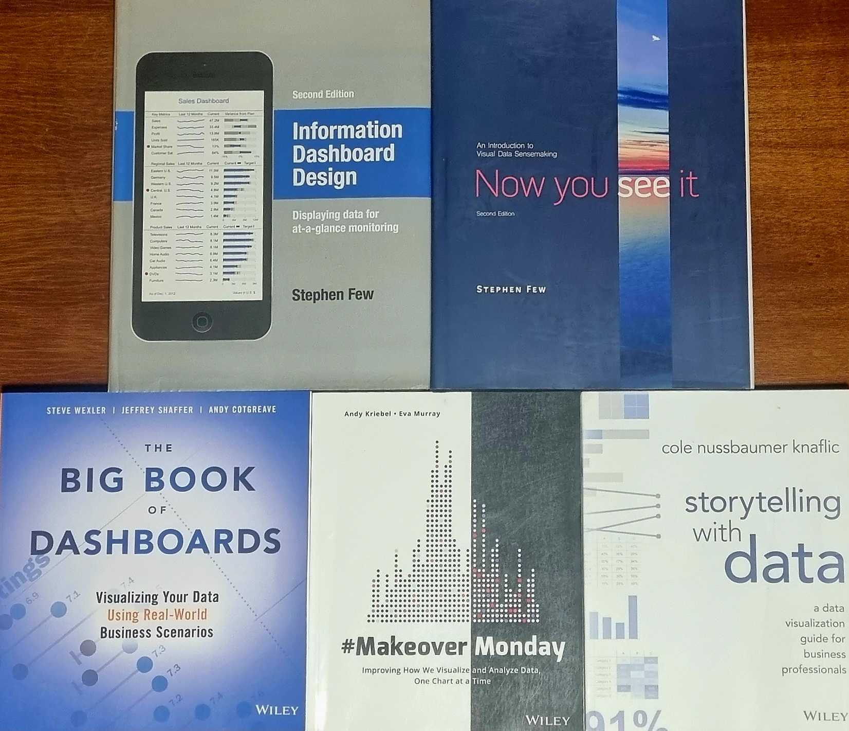
Books that helped me improve my data visualization skills
The Build
- Automation First: Engineered complex SQL logic and automated daily updates via Apps Script.
- Tool Agnostic: Tested Data Studio and Power BI, building two versions to compare strengths.
- Action Over Art: Prioritized clarity, no flashy animations, just trends hello, sparklines! and red flags.
The Result
Within six months, we identified warning signs that customers weren't fully utilizing our platform, key features were underused. We proactively engaged low-scoring customers to teach them how to get the most value from our software.
- 30%+ improvement in average customer health scores.
- Discovered 2 high-risk customers on the brink of churn, addressed and retained immediately.
- Zero churn restored, showing proactive strategy beats reactive chaos.
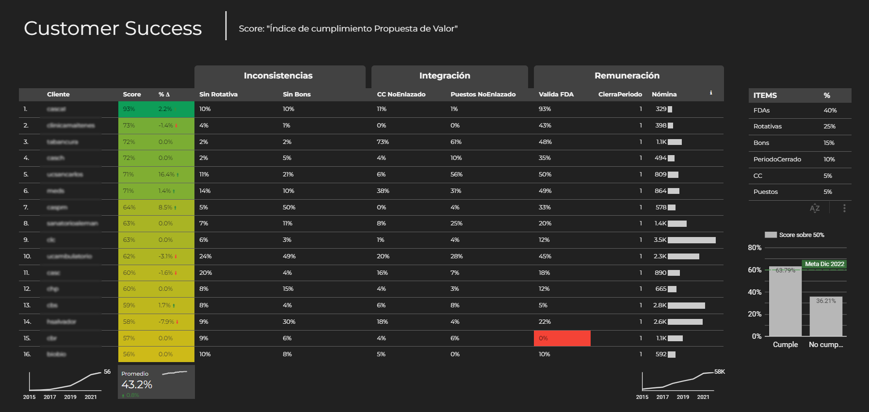
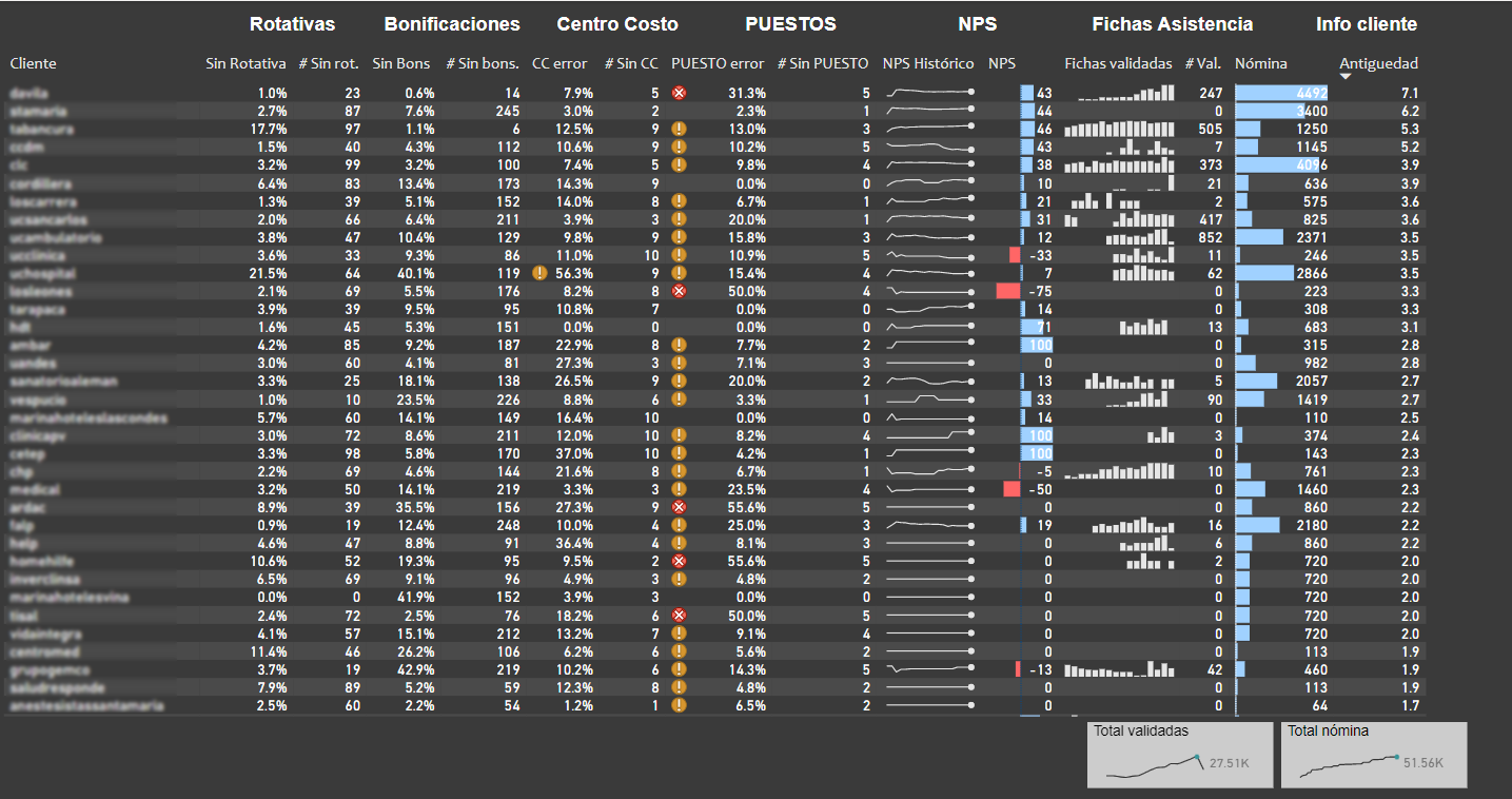
The final result wasn't a 'fancy' dashboard, but a simple table where we could monitor every customer's health metrics at a glance and track their weekly progress.
My thoughts on data visualization
I used to think great dashboards required complex visualizations, but that's not true. They need to answer simple questions and tell a story. That's why I love adding sparklines to tables, a tiny trendline whispers louder than a wall of pie charts.