Product design · Aby (AI Entertainment)
Designing an AI streaming app for mobile and web, end to end
From competitive research to a full design system, I designed every screen, component and interaction of Aby's consumer app myself, on both mobile and the web.
Role
Product design + PM
Scope
End-to-end, solo
Platform
iOS, Android & web
Focus
Design system · motion · engagement
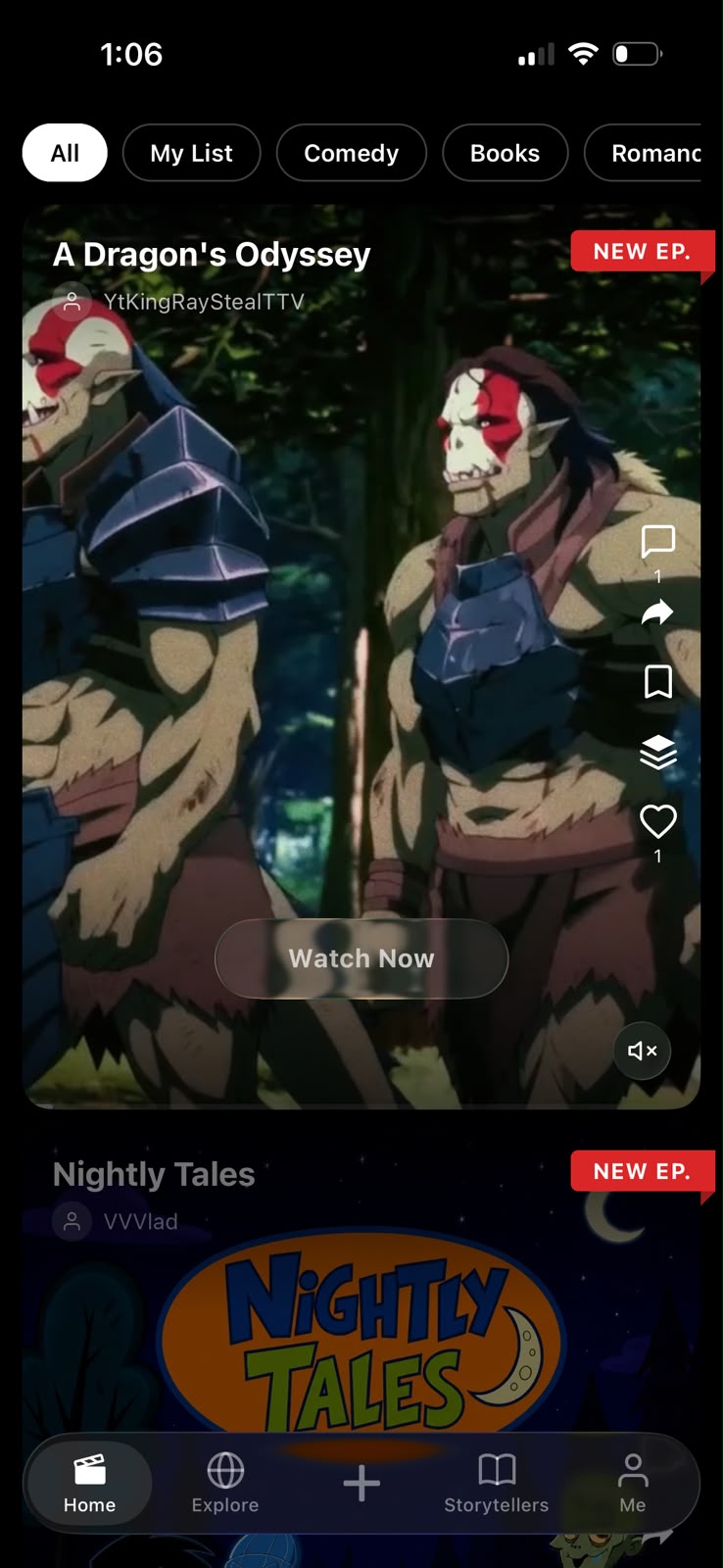
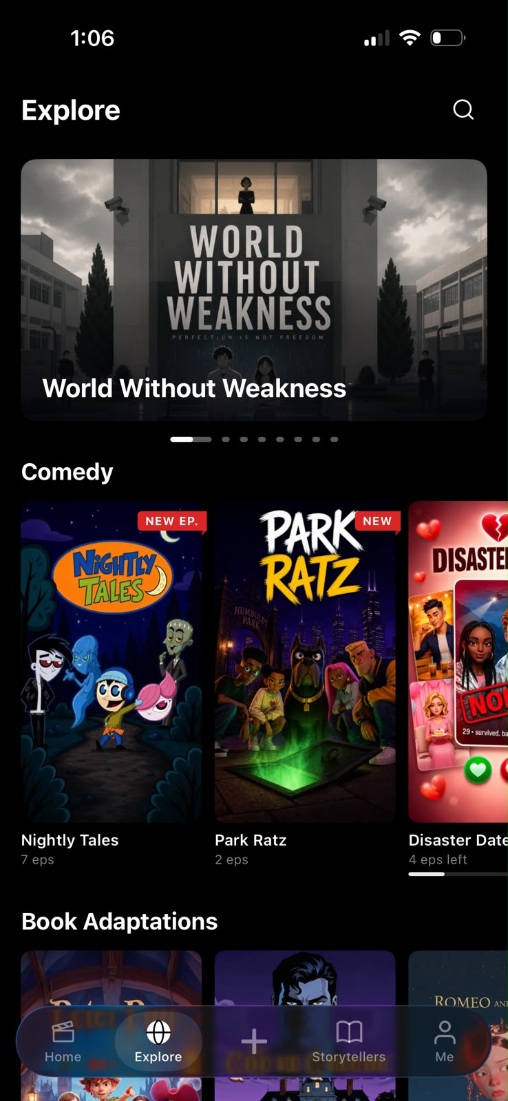
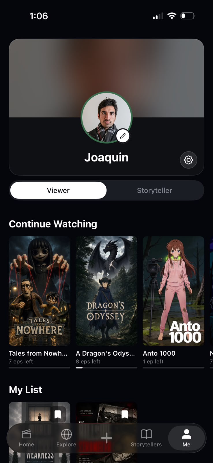
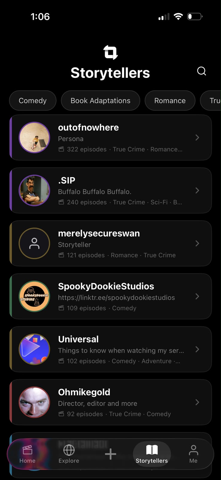
Designed for mobile and web
Aby lives on the phone and in the browser, so I designed both: the vertical, engagement-first feed on mobile and a wider, browse-forward layout on desktop, sharing one design system so the product feels like itself on any screen.
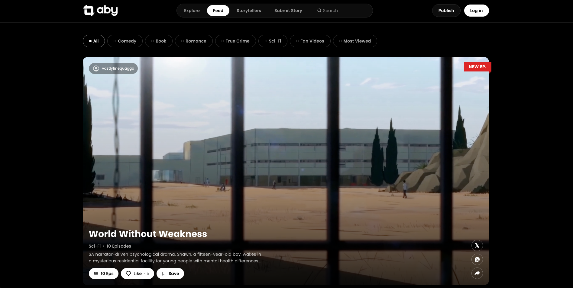
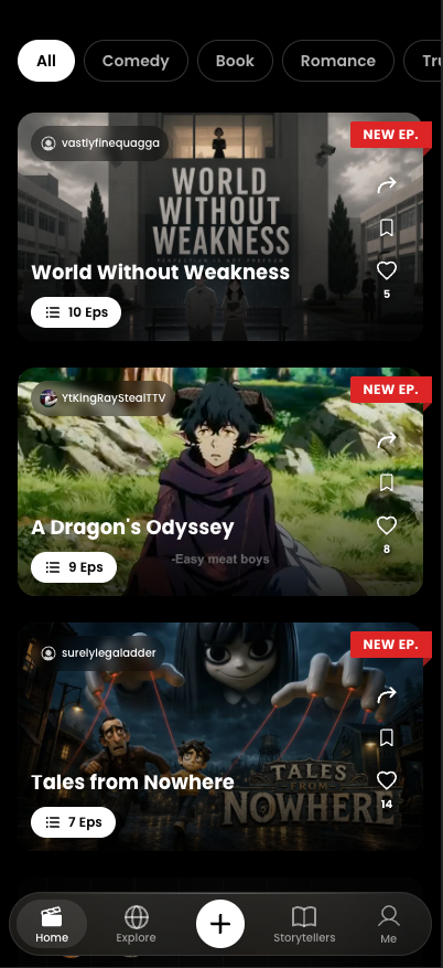
Aby is a home for AI-made episodic entertainment: Storytellers publish AI-generated series, and viewers binge, follow and engage with them. I owned the consumer app end to end, not just as the product manager but as the sole designer. Every pixel, token and transition was a decision I made and defended.
Research: I started with what people already love
Before drawing a single screen, I pulled apart the apps people already spend hours inside. Netflix and Disney+ for browse and discovery. TikTok and Reels for the vertical feed and its engagement loop. YouTube for how creators are surfaced. Wattpad for episodic, serialized reading. I mapped what each did well, and where an AI-native catalog needed something genuinely different, since here the "studio" is a single creator with a prompt and a point of view.
I paired that with a close read of the direct competition to find the gaps: onboarding that respected people's time, discovery that didn't drown them in choice, and an engagement loop that made watching feel social rather than passive.
One design system, built from zero
There was no existing component library, so I defined the foundations myself: a dark, cinema-first palette so the artwork always pops; a type scale and spacing rhythm; corner radii and elevation; and then the kit that everything is built from: buttons and their states, category chips, the "NEW EP." badges, progress bars, cards, the bottom navigation, and a toast system for confirmations and errors. Each token and each state was documented so the app would stay coherent as it grew.
The feed and the engagement loop
The Home feed is a full-bleed, one-thing-at-a-time surface that lets the content carry the screen. I designed the right-hand action rail (comment, share, save and like) and the whole like & comment system around it: optimistic taps that respond instantly, animated counts, and a comment sheet that slides up without ever pulling you out of what you're watching.
Discovery without the paradox of choice
Explore blends a hero carousel with genre rows (Comedy, Book Adaptations, Romance), where every card carries its own status: "NEW EP.", episode counts, and a continue-watching progress bar. The goal was to make the next great episode feel one tap away instead of buried three menus deep.
Two apps in one: Viewer and Storyteller
A single toggle on the Profile flips the whole experience between watching and creating, so the same person can consume in the morning and publish at night. Continue Watching, My List and account settings all live behind it, and the Storytellers directory gives creators a searchable, genre-filtered home with episode counts and a color-coded identity.
Motion, states and the small stuff
Finally, I specified the parts users feel but never name: page transitions, loading skeletons, empty states, pull-to-refresh, and the micro-interactions on every tap. This is where an "AI app" stops feeling like a demo and starts feeling like a product.
My takeaway
Designing solo across an entire surface forces a rare kind of consistency: every button, animation and edge case comes from the same head. Research kept it familiar, the system kept it coherent, and the details made it feel alive. It's the project where product thinking and craft came together most completely for me.